
The long version of the title was: ‘Making a point by adapting from two great masters’. I shortened it to fit the context. Since Polias is an interpolated from two masters, it may also have fit the font we used. When deciding this title, turning the crisis of untranslatable words into an advantage was inevitable, so no pun intended.

Two excerpts from two masterminds… First, quoting from Oruç Aruoba (14 July 1948 – 31 May 2020), influential poet, philosopher, writer, academic and translator. From a book of him.1 Second, extracting from Emin Barın (2 June 1913 – 29 December 1987), Turkish calligrapher and bookbinding artist. From the letterforms he designed. In homage, admiration and gratitude.


Compact accents
Featured above, Compact accents2 stylistic set OpenType feature of the Polias typeface and its ‘VE’ ligature (means ‘and,’ or Turkish ampersand). Both solutions were designed according to Emin Barın’s work. A-circumflex (the capped letter A) has a construction worth highlighting, which you’ll find below.
A paragraph awaiting its turn in the Introduction section of an unpublished study. Can be quoted as it is:
It may not be possible to accurately appreciate Emin Barın’s Latin script works without his graduate school (Hochschule für Grafik und Buchkunst Leipzig)3 background and his revivals of Rudolph Koch’s Neuland and Kabel fonts. Koch was his lecturer Wiemeler’s former school colleague.
Cedillas

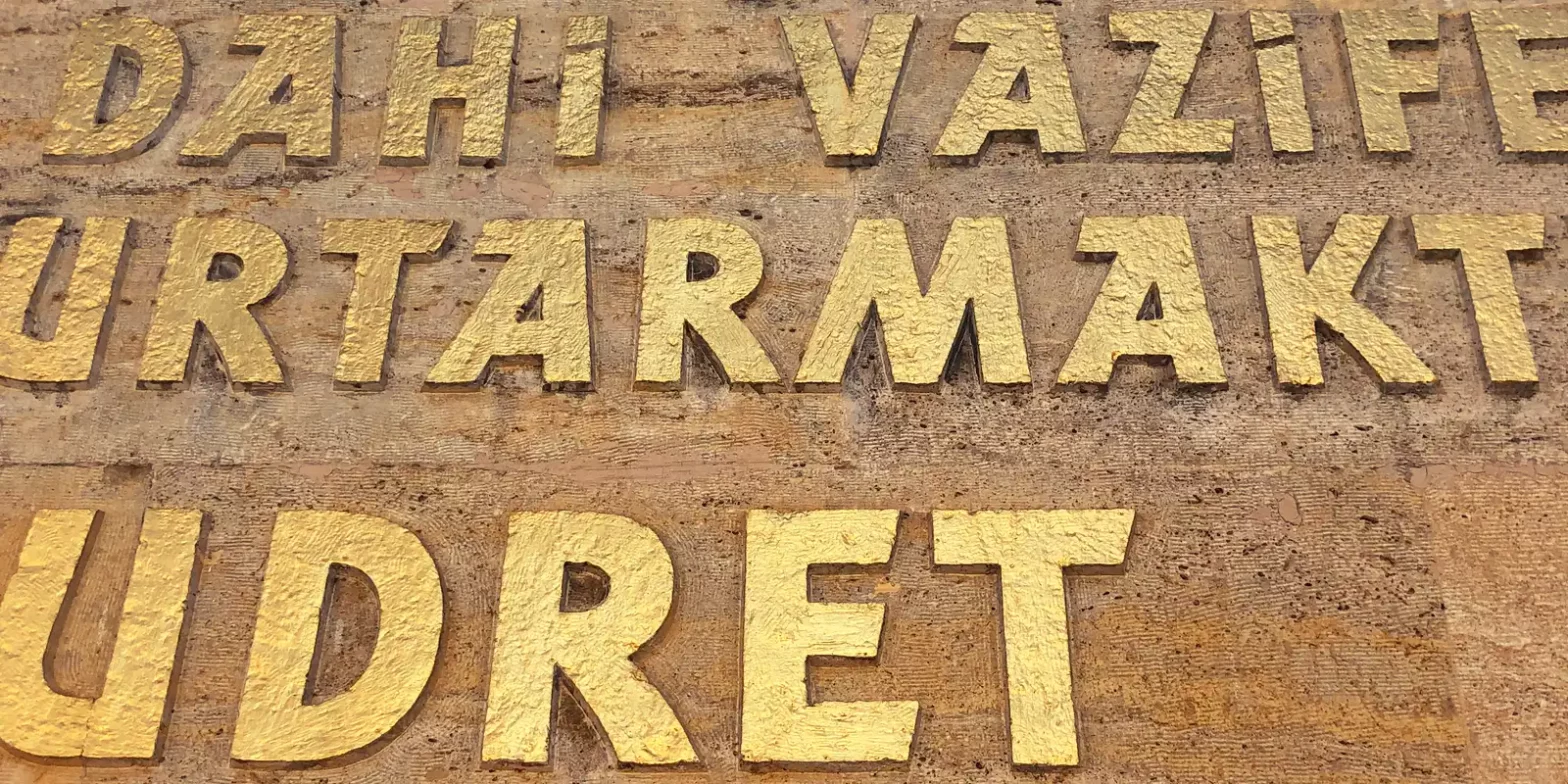
Unfortunately, we do not have any concrete information about whether the inscriptions in the METU Atatürk Monument belong to Emin Barın. This is not an item among his works in various sources, but the similarity of the letters to the MSGSF 50th Year Monument and the fact that both are Neuland interpretations reveals the possibility of Emin Barın’s design. (Barın is known to be working on a Neuland revival):
“He has done some exercises by designing the lowercases of the ‘Neuland’ typeface, which is Koch’s design and has only capitals. Classical Antique type has been interpreted differently by each type designer. Emin Barın took his place among these interpreters.” 4
It is the positions of the cedilla marks that further increase this possibility. In these works, the cedillas of the letters ‘Ç’ (C-cedilla) and ‘Ş’ (S-cedilla) are not center aligned below the characters, but have been shifted to the corner so that they do not cross the baseline, as has rarely or never been seen before. Integrating or repositioning diacritics with the base character to make narrow leading possible is not a new practice, but for the cedillas, these positions are unusual.


“Homelands are diverse, but civilization is one.”
M. Kemal Atatürk, 1923
Basque style A character as A-circumflex
In Emin Barın’s inscriptions, a letterform resembling Basque style A characters shaded with a horizontal line on top of the Apex (crossbar apex) appear with a different function: in place of an A-circumflex.


Examples from Atatürk Mausoleum


This consideration of the circumflex sign on the top ‘A’ is peculiar to the new inscriptions made in 1981.

The circumflex marks used in the A-circumflex characters of the 1953 main inscriptions are in the form of a slanting brushstroke, which is also integrated with the letter ‘A’, but quite different and distinctive, with a thicker and higher ending.

Unreleased hypothetical font samples


Ampersand alternative in ligature form
‘VE’ ligatures, which can be accepted as the Turkish equivalent of the ampersand are of two types, one normal and the other narrow, in the inscription of the Address to Youth. These ligatures are similar in form, and there is a scaled-down but extended variant in the 10th Year Speech inscription.

Vertical ligatures

The fourth and fifth types, on the other hand, stand out as an unfamiliar and prominent shape, one of which is small and centered on the horizontal, and the other is at the cap height: The letters ‘V’ and ‘E’, which are aligned to the vertical axis by increasing their width, have been combined in one body.


As typography enthusiasts in Turkey well aware, the search for the ‘ve’ ligature or Turkish ampersand character is not limited to these letterforms, and although there is no widespread use yet, we can say that remarkable designs have already emerged. This is a topic worth discussing with other examples and in more detail in another article.
Footnotes
- Aruoba, Oruç (2001), Çengelköy Defteri. Metis Kitap, İstanbul. ↩︎
- This feature is referred to by different terms such as lowered diacritics, joined accents, compact accents, etc. These terms describe the form relationship between accent marks and the base glyph according to the level of sincerity. Although there are exceptions, they are forms in which accent marks are removed from being a separate part and reduced to a protrusion by being articulated to the base character construction. ↩︎
- Hochschule für Grafik und Buchkunst / Academy of Fine Arts Leipzig (HGB), Wikipedia ↩︎
- Abdullah Taşçı (2007). Hocam Emin Barın. Grafik Tasarım, p.53, Issue 7 (April), İstanbul. ↩︎
- “Memleketler çeşitlidir, fakat uygarlık birdir.” SALT Araştırma, Photos of METU Atatürk Monument. Ankara, 1966 ↩︎
Cover image
Address to Youth inscription detail (Jun 30, 2020). Photo by author.
Türkçesi:
İki Usta (PDF)