
Like most modern fonts, Minnak has some unique or generic features. Although it would be better to use the font’s capabilities and feature details in a specimen file rather than displaying them in the infinite scroll web pages, — since this is a dedicated work that we plan to deal with collectively in the future — in the present post we’d like to present Minnak’s feature highlights and rationale.
Content
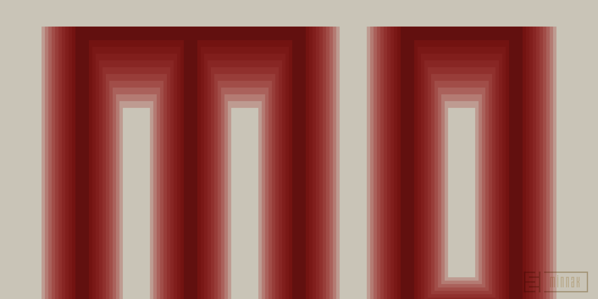
- Linear weight progression
- Numbers
- Discretionary Ligatures
- Lettering with multiple lines
- Functional space characters
- Turkish ampersand glyph
- Stylistic sets
- Unusual letters
Linear weight progression
Linear distribution is used for the weight progression.1 This setup, here, means that some of the thicker weights start from Ultra Light are at the exact double thickness of the lighter weights (namely, Ultra Light is double of Hairline; Light is double of Thin and half of Black, etc.).

Here is a list of Minnak’s weights and the corresponding classes for each:
50Hairline (Kılcal)2100Thin (İnce)150Ultra Light (Ultra Açık)200Extra Light (Ekstra Açık)300Light (Açık)400Regular (Normal)500Medium (Orta)600Semi Bold (Yarı Kalın)700Bold (Kalın)800Extra Bold (Ekstra Kalın)900Black (Siyah)
Numbers
Minnak has Proportional and Tabular numerals (pnum, tnum) and both Lining and Old Style (lnum, onum) variations of them. The default number set is Proportional Figures.

Some numbers have different form options depending on their Stylistic Sets (ssXX). Other numeric capabilities in Minnak are the OpenType features such as Superscripts and Subscripts (sups, subs), Numerators and Denominators (numr, dnom) with Fraction (frac) function, basic Ordinal Numbers (ordn), and Slashed Zero (zero).

Discretionary Ligatures
Minnak has over 90 Discretionary Ligatures glyphs containing different pairs of letters (some of them triplet, including the ‘www’ group) as a sum of uppercase and lowercase letters.

Some of the Discretionary Ligature glyphs are accompanied by alternatives triggered by the use of Stylistic Set preferences.

Lettering with multiple lines
Minnak includes characters and glyphs which make it possible to create very interesting lettering compositions with the help of two or more lines one below the other. Most of these are alphabetic letters whose shapes are designed with this function in mind. Some lettering requires the use of left or right-hand extension glyphs and punctuation marks, which are also available in every Minnak family font.


Functional space characters

The widths of the special-function space characters are proportional to the typeface, but can also be matched to letter widths to facilitate lettering adjustments when required.
Turkish ampersand glyph
The ampersand (&) character can be replaced by the Turkish ampersand glyph using the dedicated Stylistic Set (ss12).

This option, which is intended to be used instead of the conjunction ‘ve’ in Turkish texts if desired, and whose predecessors are embodied in the designs of Halis Biçer and Ahmet Altun, is also included in Esintype fonts. Instead of using the ‘Discretionary Ligatures’ (dlig) feature in encoding, the ‘Stylistic Set’ (ssXX) feature, which processes the standard character (U+0026) by substitution method in order not to break the semantic chain, is preferred. In this application, the user activates the ‘ss12 Turkish ampersand’ option after using the ‘&’ character directly.
Stylistic sets
ss01Rectangular forms (Dik açılı formlar)3ss02Unicase caps (Unicase büyük harfler)ss03Meandering M, N, W (Menderesli M, N, W)ss04Interlocked a, e, s, z (Kenetli a, e, s, z)ss05Pseudo Runic alternates (Runikvari alternatifler)ss06Pseudo Ancient alternates (Antikvari alternatifler)ss07Narrow E, F, L, r (Dar E, F, L, r)ss08Cedilla accent alternate (Alternatif çengel imi)ss09Underlined A, D, N, O, U (Çizgili A, D, N, O, U)ss10Compact accents (Kısa aksan işaretleri)ss11Sinistroverse A (Sağdan sola A)ss12Turkish ampersand (Türkçe ve işareti)
Unusual letters
Pseudo Runic and Pseudo Ancient alternates occupy a prominent place among the Minnak stylistic sets. Thanks to the OpenType feature, certain letters in Minnak are optionally replaced with alternatives resembling the letters of the Runic or Ancient alphabets.

The term ‘pseudo’ is meant to indicate that, these are not exactly the same as the characters in the respective scripts. These glyphs in Minnak were drawn to add depth to the texture of the type by reminiscent of the originals.
Although Minnak is a reasonably simplex typeface, it’s the fruit of the Proto-Minnak tree that also directs our other ongoing works, part of a broader platform through subsetting, whose multi-script features span the scripts of extinct languages. Unusual letters represent ancient letterforms as a legacy from this background of our work.
Responsibility for Turkish phrases

Most of the Turkish terms and phrases we use on the Esintype website and in our own fonts are from Turkish local versions of macOS and iOS operating systems. Some of the others are from other localizations and some of them are from open sources such as the Turkish Typography Community repertoire. All the rest are our own translations, since there is no known use in Turkish. You can use them by citing us or at your own risk.
Footnotes
- For a start on the distribution of weight values for an interpolation range, Luc(as) de Groot’s Theory of Interpolation is a pretty comprehensive article. ↩︎
- Modern font formats allow localisation of some of the definitions in OpenType tables. Minnak’s weight definitions have Turkish localisation support and are displayed as such on operating systems and software that can use this feature. ↩︎
- Modern font formats make it possible to localise some of the name definitions in OpenType tables. As with other typefaces we produce as Esintype, Minnak stylistic sets also have a Turkish naming option and the operating systems and software that can use this feature are displayed in the relevant panels like that. ↩︎
Türkçesi:
Minnak’tan ayrıntılar (PDF)