
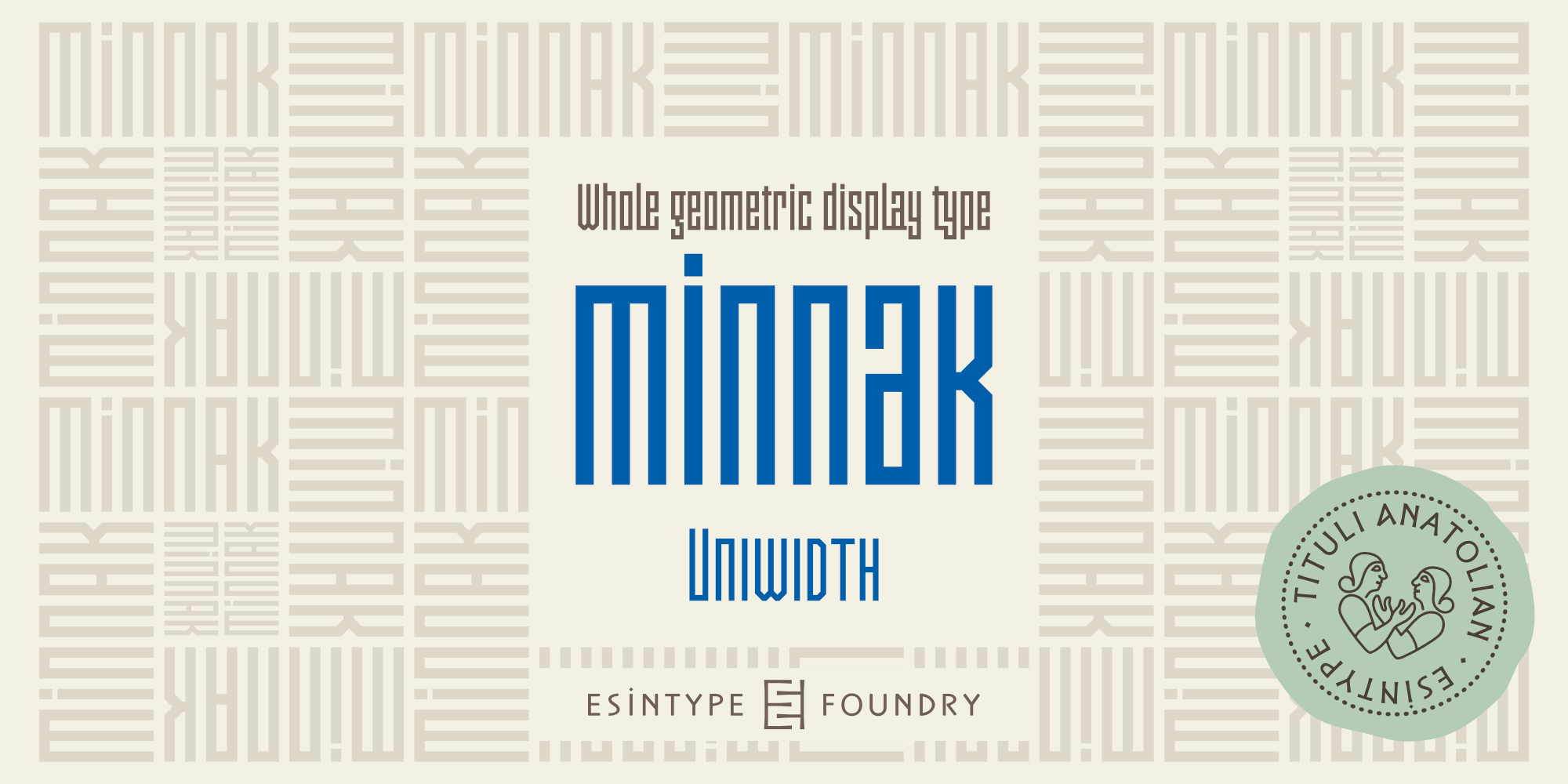


Minnak, as a whole geometric display type, is our take on Square Kufic (Makili) style Latin script fonts, comes in eleven weights with linear progression. Supports wide range of Open Type features, with many stylistic alternates in 12 contexts.
Minnak family
11 Fonts
Minnak Hairline

Minnak Thin

Minnak Ultra Light

Minnak Extra Light

Minnak Light

Minnak Regular

Minnak Medium

Minnak Semi Bold

Minnak Bold

Minnak Extra Bold

Minnak Black

About Minnak
Minnak, as a whole geometric display type, is our take on Square Kufic (Makili) style Latin script fonts, comes in eleven weights with linear progression. It is an Uniwidth typeface at the core. From Hairline to Black, all multiplexed weights take up the same space in width and can be used interchangeably. Supports wide range of Open Type features, with many stylistic alternates in 12 contexts.
The key difference between Minnak and Makili style is that the latter must have the exact square counters with no diagonal strokes, and any other components of a letterform must conform to be proportional. Such style-specific requirements dictate the overall dimensions of the glyphs and therefore, there can be only minor differences between the typefaces. In Minnak, counters are rectangular because of its narrow and condensed proportions, but the Makili form influence is still manifest. This impression is more pronounced in Medium weight, where negative spaces and stem thickness are equal.
Contrast and virtually no optical correction were presented, as characteristic of its genre had to have equal horizontal and vertical line thicknesses. As per the minimal and authentic look of the type, all glyphs are drawn as straight or only as 45-degree diagonal strokes. The representation of the ‘diagonal-less’ rectangular approach in the original style is preserved by stylistic alternatives that make its similarity in visual aesthetics clearly visible. Marks and punctuation is another feature that doesn’t follow the strict rules of the origin style.
Minnak is also having a close relation with pixel fonts because in spite of its based on Makili style, it all started as a pixel font construction in the drawing stage before further steps came into play. Although not a pixel font, all building parts of the glyphs in Minnak share the same unit precision, as they are designed with pixel equivalents in mind. Even space characters are set to match glyph widths, meeting the demands of certain typesetting or multi-line lettering compositions.
With its Pseudo Ancient and Runic alternates, extension parts and ornaments included in all weights, Minnak is suitable for branding, logo and monogram designs, the screen titles and headlines, packaging, posters, book covers and more, where it shines at big sizes. Its pixel font-like appearance makes it a significant choice for the modern compositions. Thanks to mostly uniform width design, it is possible to use Minnak also as a system for lettering. This feature can be used as vertical fitting of the letters between the lines.
As a casual expression in Turkish, ‘Minnak’ is one of the seven typeface designs in Esintype’s ancient scripts of Anatolia project, Tituli Anatolian series — representing the Seljuk period in the medieval Anatolia and their tradition of architectural stone ornamentation.
Additional Information
- Article covering features: Details of Minnak
- Minnak release post
Scripts
- Latin
Specifics
- Designer: Ali Riza Esin
- Creation Date: Apr 04, 2023
- Debut Date: Apr 11, 2023
- Format: OpenType CFF
- Glyph Count: 1582
OT Features
aalt (Access All Alternates), c2sc (Small Capitals From Capitals), calt (Contextual Alternates), case (Case-Sensitive Forms), ccmp (Glyph Composition / Decomposition), dlig (Discretionary Ligatures), dnom (Denominators), frac (Fractions), kern (Kerning), liga (Standard Ligatures), lnum (Lining Figures), locl (Localized Forms), mark (Mark Positioning), mkmk (Mark to Mark Positioning), numr (Numerators), onum (OldStyle Figures), ordn (Ordinals), pnum (Proportional Figures), sinf (Scientific Inferiors), smcp (Small Capitals), ss01 (Rectangular forms), ss02 (Unicase caps), ss03 (Meandering M, N, W), ss04 (Interlocked a, e, s, z), ss05 (Pseudo Runic alternates), ss06 (Pseudo Ancient alternates), ss07 (Narrow E, F, L, r), ss08 (Cedilla accent alternate), ss09 (Underlined A, D, N, O, U), ss10 (Compact accents), ss11 (Sinistroverse A), ss12 (Turkish ampersand), subs (Subscript), sups (Superscript), tnum (Tabular Figures), zero (Slashed Zero)
Tags
Anatolian, Architectural, Arrows, Book Cover, Branding, Calligraphy, Carved, Clean, Compact, Compressed, Condensed, Display, Display Type, Fun, Geometric, Geometric Sans, Hairline, Headlines, Hipster, Historical, Industrial, Inspirational, Kufic, Language Support, Logo, Logotype, Ligatures, Makili, Mechanical, Modular Letters, Monogram, Monoline, Monumental, Opentype, Packaging, Pixel Face, Poster, Rectangular, Sans, Sans Serif, Seljuk, Signage, Small caps, Stone, Stylish, Technical
View and license at
Monotype has announced the discontinuation of the Linotype.com, Fontshop.com, and Fonts.com sales platforms. All font licenses previously sold on these platforms are now available for purchase on MyFonts.com and through Monotype’s subscription service.
Türkçesi:
Minnak (Bilgi metni PDF)